Design & Color
Five Color Stories for the Island Interior
Color in Hawaii is a problem of abundance. The light here is generous to a fault — it saturates everything, intensifies every hue, makes ordinary colors vibrate with a quality they don't have elsewhere. A palette that reads as sophisticated in a Portland living room can, transported to a Kahala home with southern exposure, become either too much or invisible against it. The light will decide.
What I've found, working with interiors across Oahu and the neighbor islands, is that the most successful Hawaiian palettes don't try to match the landscape. They respond to it. They choose tones that allow the view to do its work — that give the Ko'olau mountains or the Kona coastline or Hanalei Bay something to play against, rather than competing with them.
The postcard version of Hawaiian color — hibiscus red, bright turquoise, plumeria yellow — isn't wrong, exactly. But it's one thin slice of what's actually here. Here are five color stories that take the islands more seriously.
Palette One: Volcanic
Drive through the South Kona coast on the Big Island and the landscape does something most visitors don't expect: it becomes austere. Black pāhoehoe lava fields running to the ocean, nothing growing, nothing softening the edge between earth and sky. It is one of the most otherworldly landscapes in the Pacific, and it produces a color vocabulary of extraordinary sophistication.
The palette: Deep warm charcoal as the ground — not blue-black, but the brown-inflected dark of cooled lava that reads differently than urban gray. Against this, Waimea dirt: the oxidized sienna and terracotta of the Big Island's red soil, color that appears throughout the upcountry roads and carries warmth as an accent against the volcanic dark. White appears as relief — the bone white of bleached coral, the white of things dried by sun and salt air.
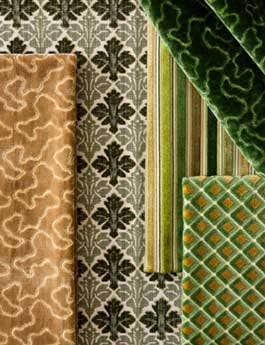
In textiles: The volcanic palette calls for woven textures with visible structure — depth that catches light differently at different times of day. Bouclé and heavy linen in the dark tones; smooth, tightly woven cotton in the warm whites; a thread of copper or bronze in accent textiles that picks up the mineral quality of the landscape.
Where it works: Living rooms that want gravitas without darkness. Studies, libraries, any room where the goal is to feel enclosed and sheltered from the brightness outside. In a Kona home surrounded by lava fields, this palette is almost inevitable.
Palette Two: Ocean Depth
The color of the Pacific around Hawaii is not one thing. From the rocks below Portlock in the early morning, it's a particular gray-blue — dark, serious, cold. Fly in over Kāne'ohe Bay and it goes turquoise-clear in the shallows, then deepens to the indigo of open water past the reef. Stand on the North Shore at sunset and the ocean is something else entirely: oxidized gold on the surface, darkness below.
The error most people make is reaching for the turquoise — the reef color, the most immediately appealing. But turquoise is an accent tone, not a ground. It vibrates too much to anchor a room.
The palette: Deep navy as the anchor — the color of Kona water at depth, not the bright blue-green of the shallows. Against this, a muted aqua in the mid-tone position, and bleached sand — the color of dry white coral on a Lāna'i beach — as the light tone. Seafoam appears as a pale accent, used with restraint.
In textiles: This palette rewards fabrics with sheen — a silk-blend upholstery that catches light differently as the sun moves, a linen with a slight slub that creates tonal variation within a single cloth. The navy should be deep enough to read as ground, not accent. If it feels bright, it's too light.
Where it works: Bedrooms and master suites, where the depth of the navy creates envelopment. Any space that opens to an ocean view — a Hawai'i Kai great room, a Kailua lanai, a Hāna cottage — where the palette inside extends the visual rhythm of the water outside.
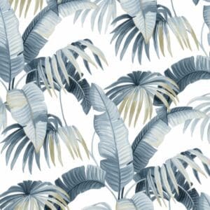
Palette Three: Botanical
The green of Nu'uanu Valley is not the green of the tropics as most people imagine it. It is muted, complex, slightly gray-green — the color of things growing in filtered light, in deep shade, in the particular quality of damp that the valley fog produces. Stand at the Pali lookout on a misty morning and you're looking at a color that has almost nothing to do with commercial Hawaiian design. That green is what I reach for.
The palette: Manoa canopy as the ground tone — moss-dark, almost olive, the green of the windward Ko'olau at a distance. Against this, dried taro leaf in the neutral position: not white, but the color of undyed linen, of pale kapa cloth left in the sun. Natural wood tones — honey koa, mango, the warm brown of monkeypod — as the third voice. Plumeria white appears at the lightest edge as highlight.
In textiles: The botanical palette calls for natural fibers and natural textures — linen, hemp, undyed cotton. The green should appear in window treatments and large upholstered pieces. Cream and natural tones carry the smaller items. A controlled use of botanical-print textiles can work here — a single throw, a pair of pillows, not the whole room.
Where it works: Living spaces that open to garden or mountain views — a Mānoa home, a Nu'uanu property, an upcountry Maui farmhouse where the eucalyptus lines the road and Haleakalā is visible from the lanai. Dining rooms where the warmth of wood tones against the green creates the feeling of eating in a clearing.
Palette Four: Sunset Coast
There is a particular hour on the west-facing shores — Ko Olina, the Kona Coast, Lāhainā town on a clear evening — when the light becomes almost hallucinatory. The sun sets across open Pacific Ocean, the clouds catch it at a low angle, and for forty minutes the world is coral and mango and the deep rose of things ending well. It doesn't last. But it's the light this palette is trying to hold.
The palette: Lāhainā coral as the ground — the lighter, more orange-inflected tone of late afternoon on the west Maui coast, warmer and more amber than brick terracotta. Against this, a warm amber-yellow used sparingly — the color of the light itself, not the objects in it. Dusty rose as the mid-tone, warm sand as the neutral, copper as the metallic note that ties it together.
In textiles: This is the warmest of the five palettes, and it requires calibration to avoid tipping into the garish. The coral ground should be muted and dry — not saturated. The amber accent should be used as a note, not a chord. Woven textures that blend the coral and rose tones create depth without requiring a separate accent piece.
Where it works: West-facing rooms that capture the sunset — a Ko Olina living room, a Kona lanai, any space primarily used in the late afternoon and evening when these colors find their complement in the light outside.
Palette Five: Plumeria and Linen
This is the palette I recommend most often, and for a simple reason: it works everywhere. In a Kahala home with the light coming steadily from the south. In a Kailua cottage with the breezes moving through. In an upcountry Maui farmhouse on a cool morning with Haleakalā in the clouds. It has enough warmth to read as tropical without committing to anything that will tire, and it ages gracefully with the light.
Plumeria flowers — growing wild across the lower-elevation neighborhoods of every island, planted at heiau, threaded into lei — are not simply white. They are the color of white that has absorbed warmth: ivory, the lightest cream, blush at the center fading to pale gold at the edges. That quality is what this palette tries to capture.
The palette: Kahala afternoon as the ground — warm white with yellow and pink in it, the particular cream-gold of a south-facing interior at midday. Pale sage as the secondary tone, a muted green that reads almost as warm gray from a distance. Warm natural linen in the neutral position. Blush as the accent — quiet rose in textiles and accessories, not demanding attention but present when you look. Aged gold as the metallic note.
In textiles: This palette is most fully expressed in the quality of the fabric itself. Heavyweight linen in warm white, natural slub visible in the weave. Sheer cotton-linen blends in the windows, filtering light without blocking it. The occasional silk in pale blush for cushion covers in the bedroom.
Where it works: Everywhere. This is the palette that works hardest in Hawaii — sophisticated enough for formal spaces, relaxed enough for family rooms, quiet enough to recede when the view demands attention, present enough to be noticed when the light changes. If there is a color story that belongs to the Hawaiian home above all others, it's this one.
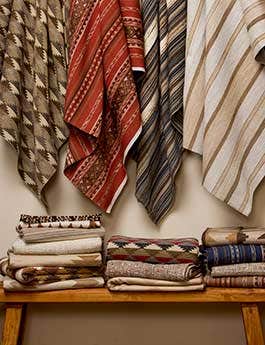
Working with Color and Textiles Together
A few principles worth keeping as you work through these palettes:
Start with the largest surface: The sofa, the window treatment, or the rug establishes the palette. The small decisions — pillows, table textiles, accessories — follow from it. Do not begin with accent pieces and attempt to build backward.
Three tones, not five: Each palette contains four or five tones, but any single room should work with three: a ground, a mid-tone, and a light. The fourth and fifth tones appear in small quantities — a single accent piece, a metallic element.
Texture is color: In a room with limited color range, the difference between a flat-woven linen and a bouclé of nominally the same tone is significant. Use textural variation to create depth within a restricted palette rather than reaching for additional colors.
Live with samples: Hawaii's light changes dramatically through the day — from the cool morning quality of the north shore to the warm golden afternoon of the leeward coast. A palette chosen in a showroom will perform differently in the actual space. Live with large fabric samples in the room for several days before committing. The light will tell you what it needs.
Stay in the Loop
New arrivals, seasonal
stories & studio notes.
Join the Hale circle. Be the first to know about new fabric arrivals, limited accessory drops, and studio events.
No spam. Unsubscribe at any time.